Gallery
Every figure on this page is generated by
examples/gallery.py
from the seeded synthetic instances in
examples/data.py
— no solver, no benchmark run, no committed data. Re-run it and you get these
images back byte for byte:
python examples/gallery.py                    # -> docs/assets/gallery
python examples/gallery.py --no-animations    # skip the GIFs
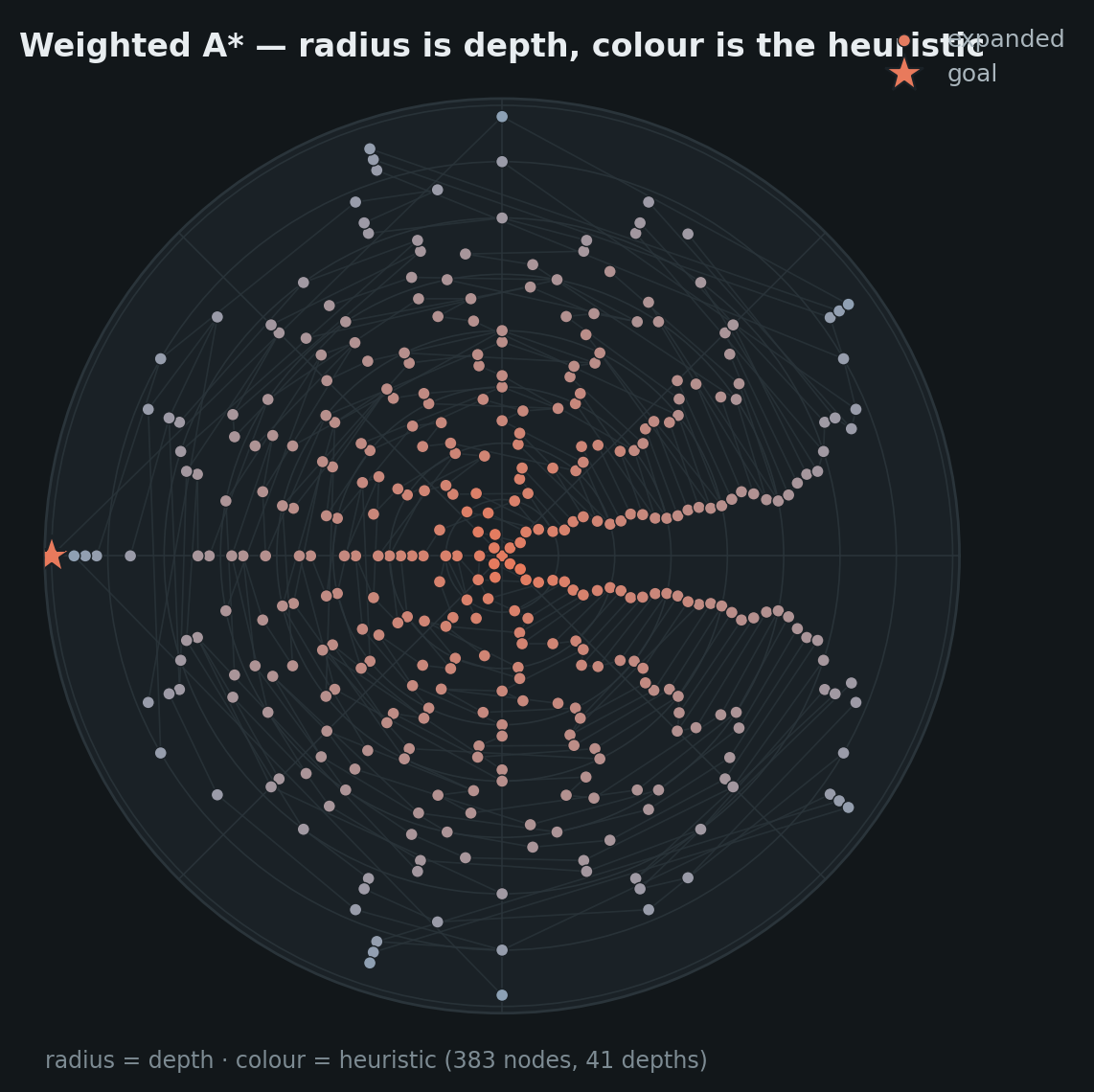
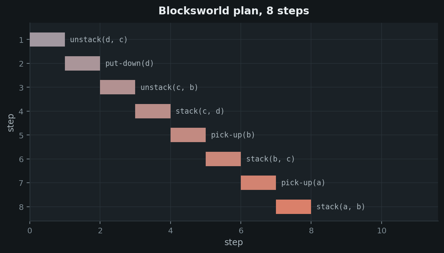
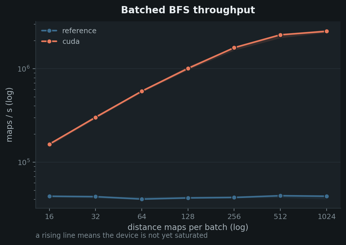
Both schemes are rendered every time, and the images below follow this site's light/dark toggle.
Grids and agents
draw_grid
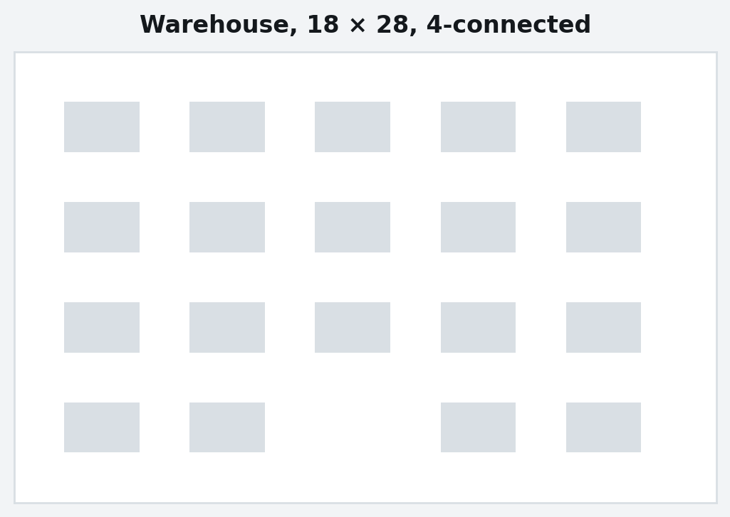
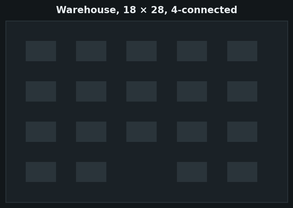
The problem. Obstacles take line — the same value as a table rule — because
they are the shape of the problem rather than a result of the search. No
lattice is drawn: the cells are the grid.
planviz.draw_grid(grid, title="Warehouse, 18 × 28, 4-connected")
draw_search
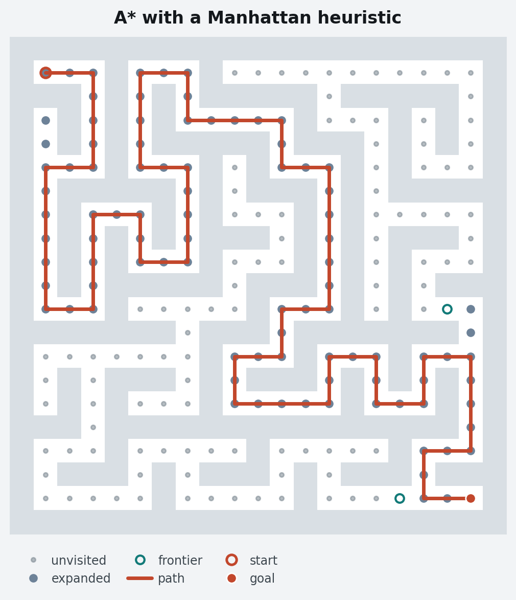
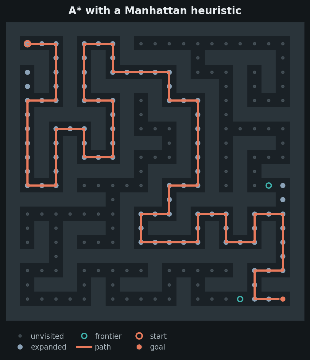
The canonical figure. Filled dot, hollow ring, connected stroke — three sets that stay distinct in greyscale.
planviz.draw_search(
    expanded=search["expanded"],
    frontier=search["frontiers"][-1],
    path=search["path"],
    grid=maze,
    start=(1, 1),
    goal=(19, 19),
    title="A* with a Manhattan heuristic",
)
draw_paths
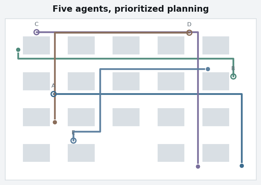
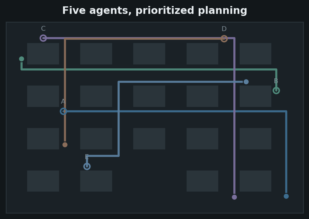
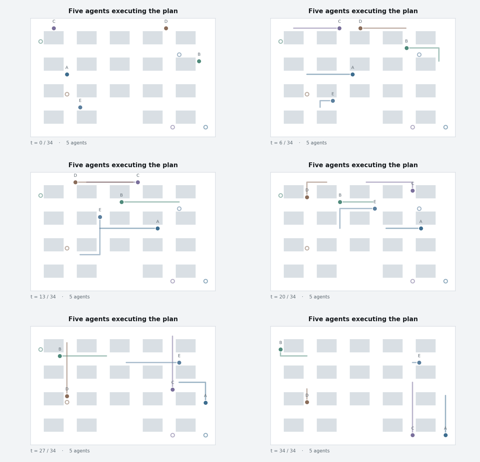
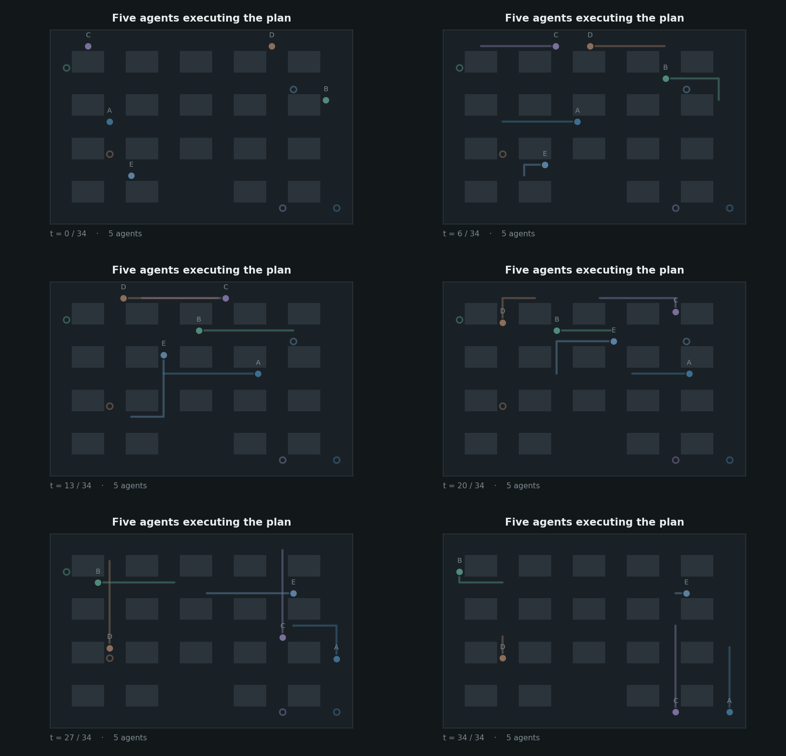
Multi-agent routes on offset rails, coloured from the agent ramp by stable index — a re-render with a different agent order does not reshuffle the figure. Each route starts on a hollow ring and ends on a filled disc, so direction is carried without arrowheads.
planviz.draw_paths(agents, grid, title="Five agents, prioritized planning")
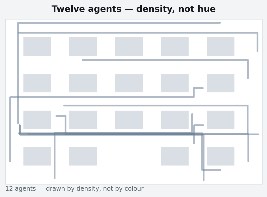
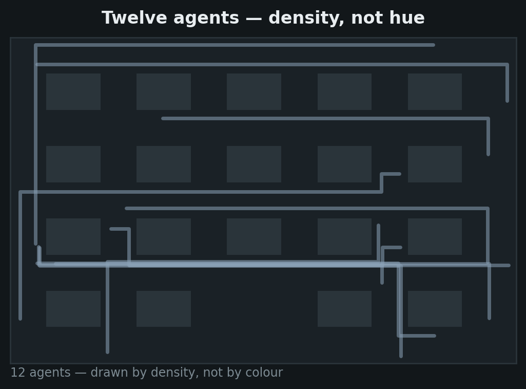
Past eight agents, hue stops being an identity channel and the figure switches to one colour with opacity — density rather than a twelve-colour legend nobody can read:
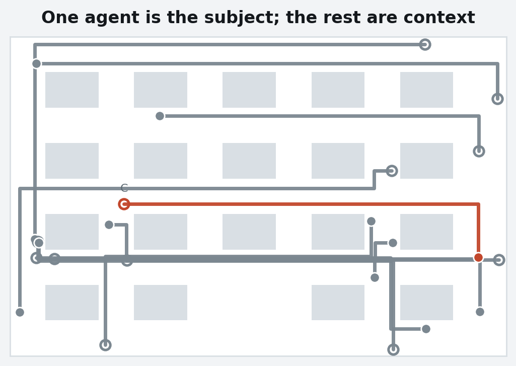
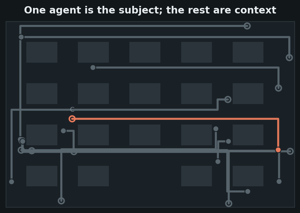
And when one agent is the subject of the figure, it takes path and every
other agent drops to faint:
planviz.draw_paths(crowd, grid, highlight="C")
draw_heatmap
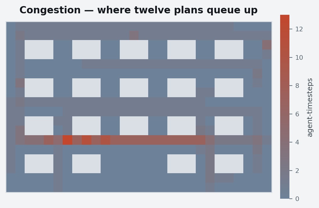
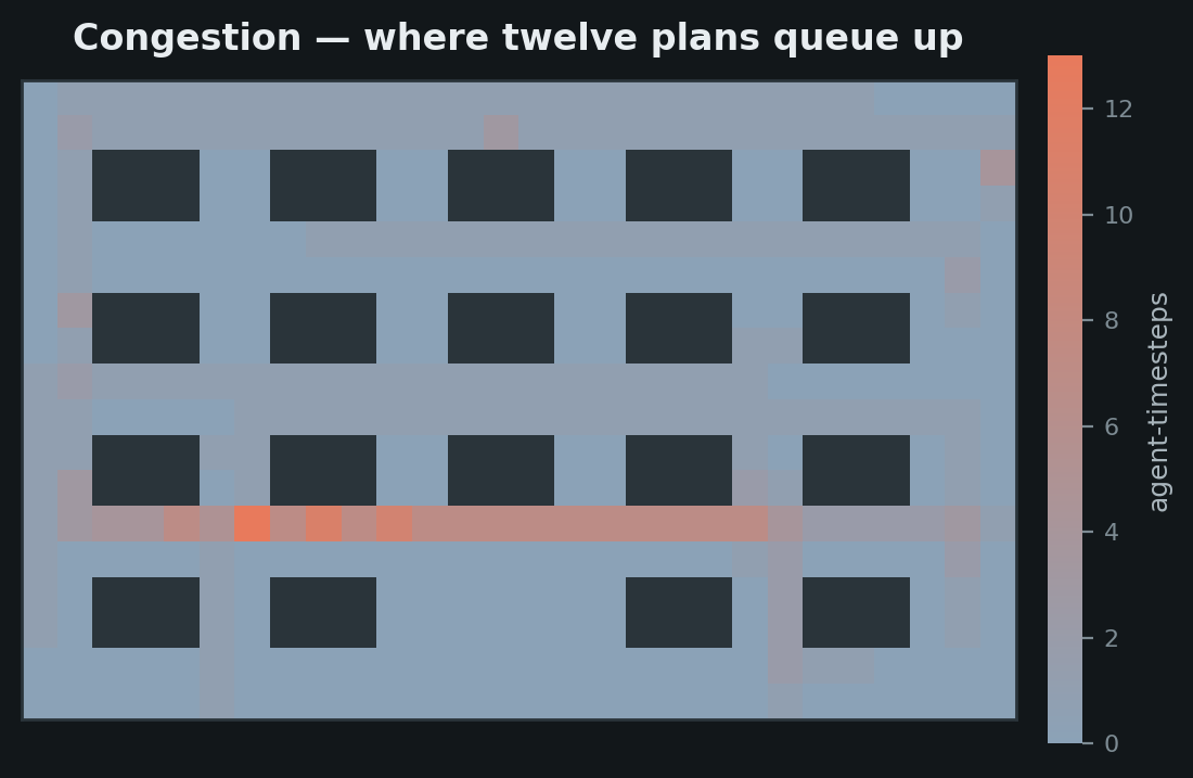
A magnitude per cell on the single-hue expanded → path ramp: warm is
expensive. Blocked cells are drawn as obstacles, not as zero — a cell no agent
could enter and a cell no agent chose to enter are different facts.
planviz.draw_heatmap(counts, grid, label="agent-timesteps")
animate_search and animate_paths
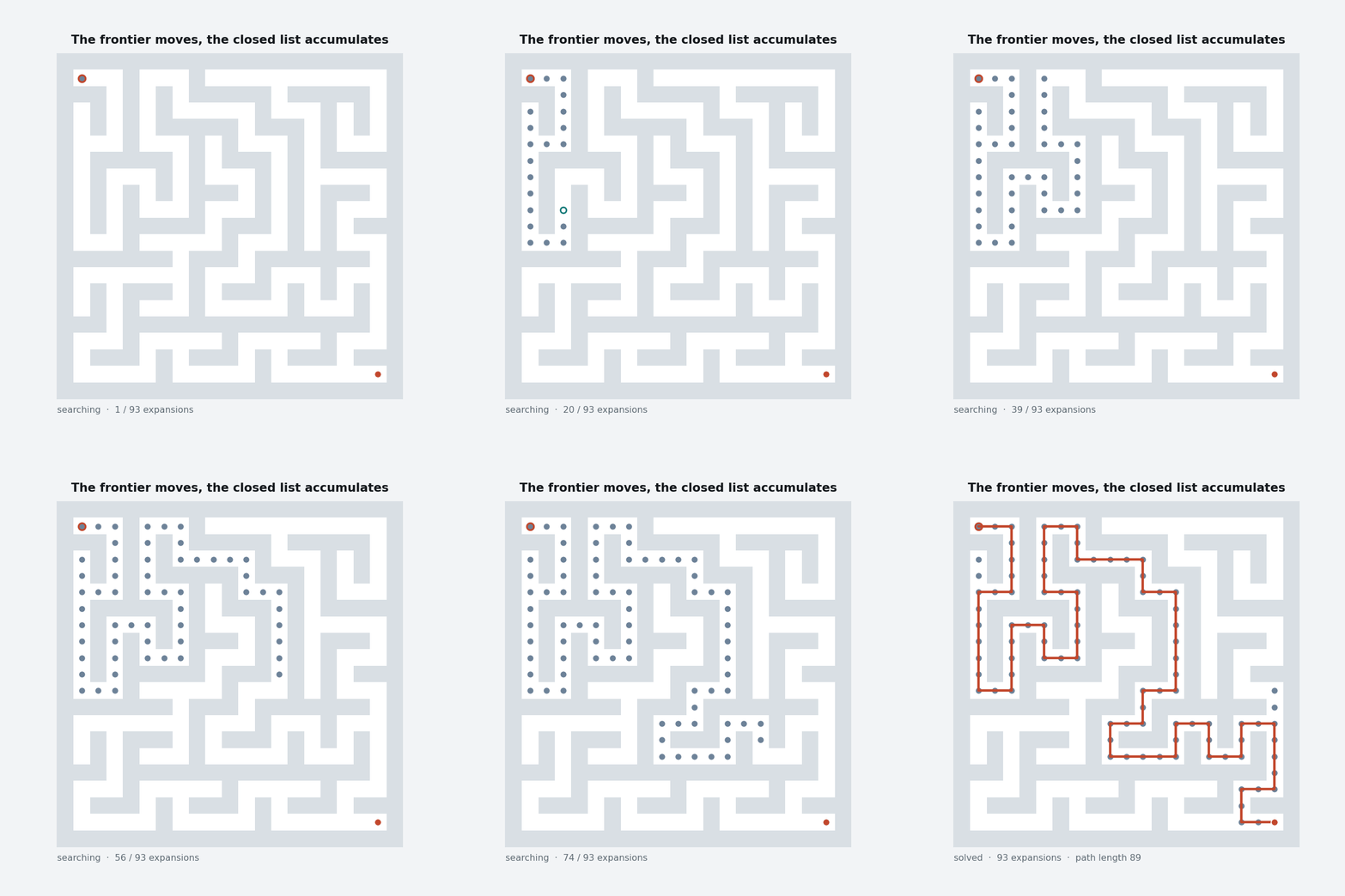
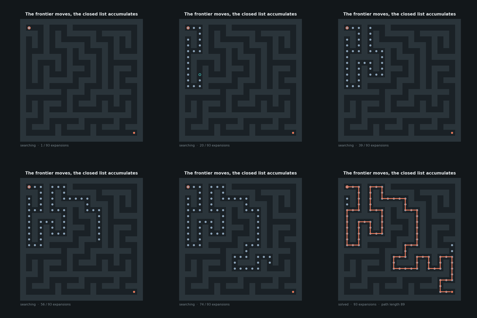
The frontier moves, the expanded set accumulates, the path appears once at the
end and stays. save_animation caps a GIF at 12 fps and 800 px wide.
anim = planviz.animate_search(
    search["expanded"],
    frontiers=search["frontiers"],
    path=search["path"],
    grid=maze,
    frames=70,
)
planviz.save_animation(anim, "search.gif")
anim = planviz.animate_paths(agents, grid)
planviz.save_animation(anim, "plan.gif")
Search progress
search_panels
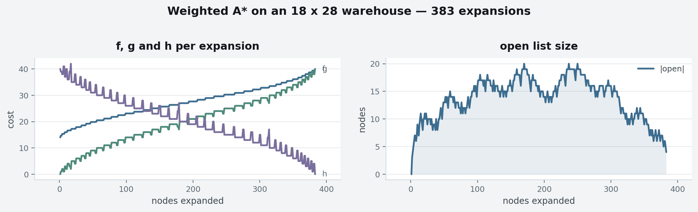
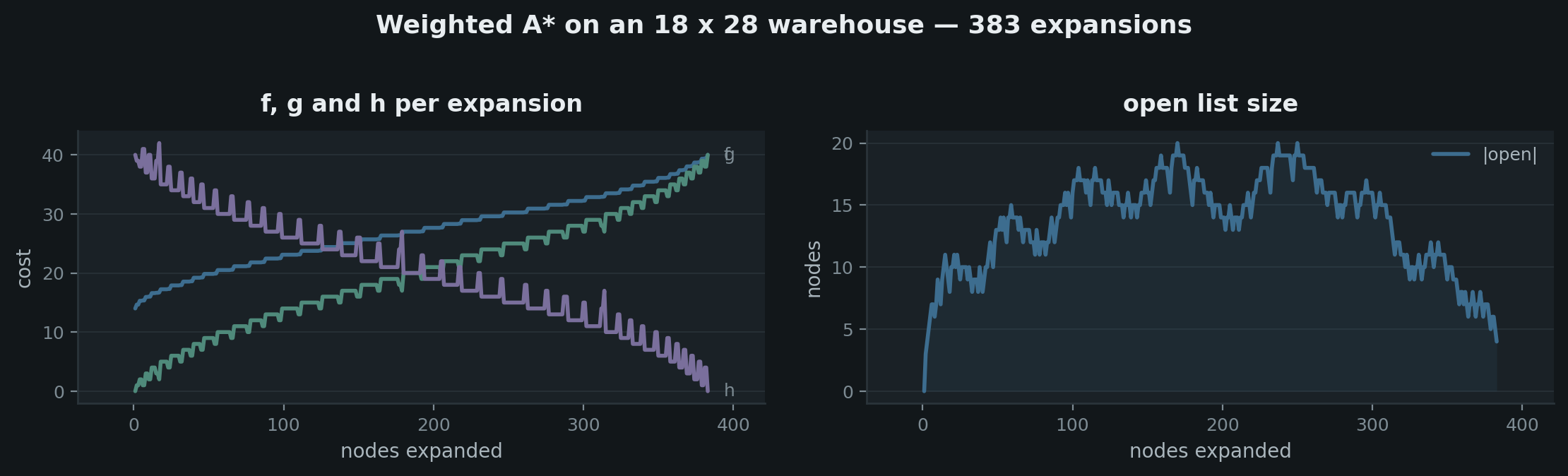
Several search_progress panels sharing one colour assignment. marks draws
dashed rules at IDA* bound restarts, replanning events, or a timeout.
planviz.search_panels(
    {
        "f, g and h per expansion": {"f": fs, "g": gs, "h": hs},
        "open list size": {"|open|": opens},
    },
    fill=["open list size"],
    ylabels={"f, g and h per expansion": "cost", "open list size": "nodes"},
    suptitle="Weighted A* on an 18 x 28 warehouse — 383 expansions",
)
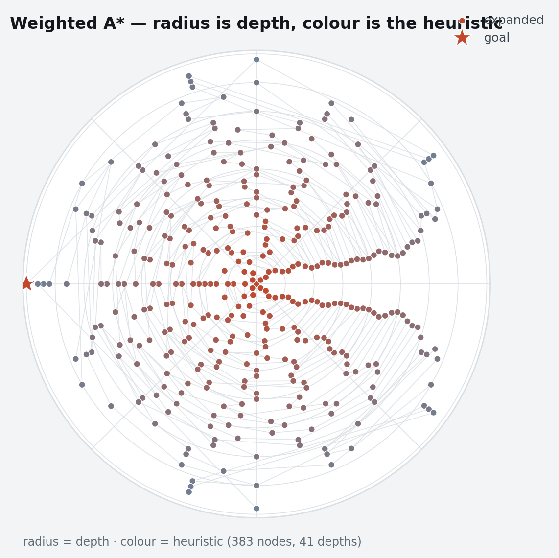
radial_wavefront
The search tree in polar coordinates: radius is depth, so the shape of the figure is the shape of the search. A uniform-cost flood fills a disc, a greedy dive is a spoke, and an A* with a good heuristic is a wedge aimed at the goal. Nodes in a ring are ordered by their parent's angle, which keeps the edges radial instead of drawing chords across the disc.
planviz.radial_wavefront(
    trace.expansions,        # (node, parent, depth, h) records, or objects
    frontier=open_ids,
    goal=goal_id,
)
plan_timeline
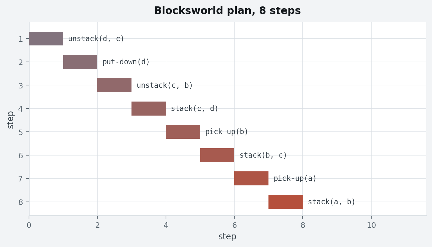
Two shapes from one function. A bare list of action names gives every step its own lane, read top to bottom:
planviz.plan_timeline(plan, xlabel="step", title="Blocksworld plan, 8 steps")
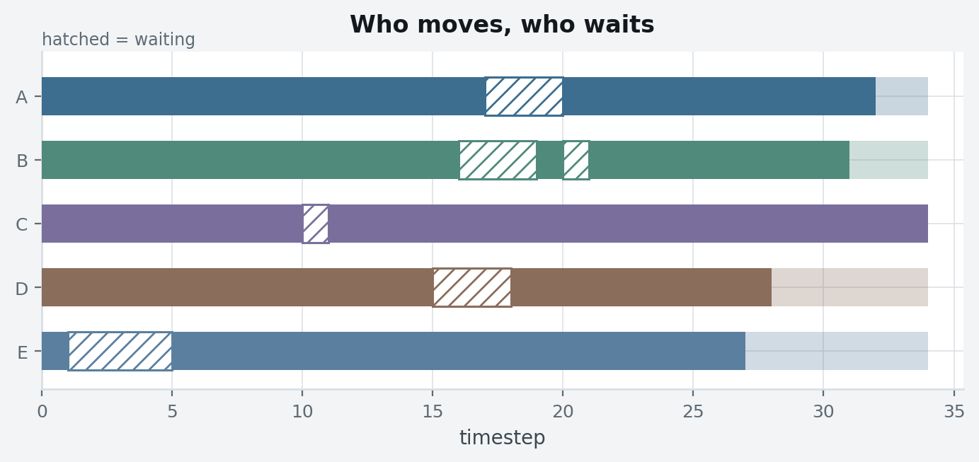
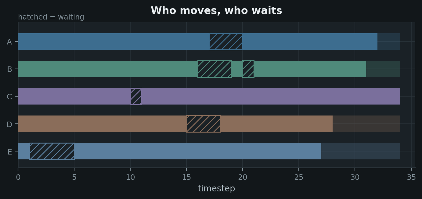
Give steps a row and it becomes a Gantt — one lane per agent, resource or
object. timeline_from_paths builds those steps from grid paths, drawing
waiting as its own hatched mark rather than as a gap, because waiting is where
coordination cost shows up and a blank gap reads as "nothing happened":
planviz.plan_timeline(
    planviz.timeline_from_paths(agents), xlabel="timestep"
)
Benchmarks
scaling_curve
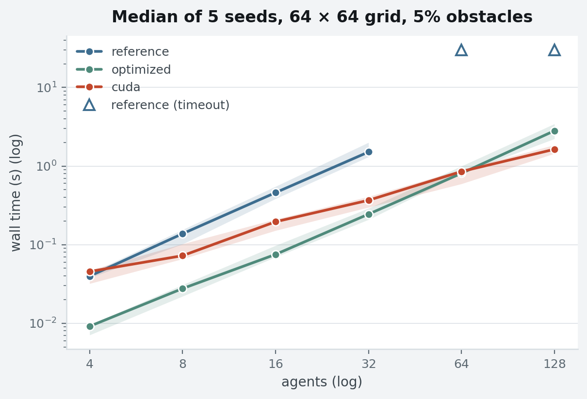
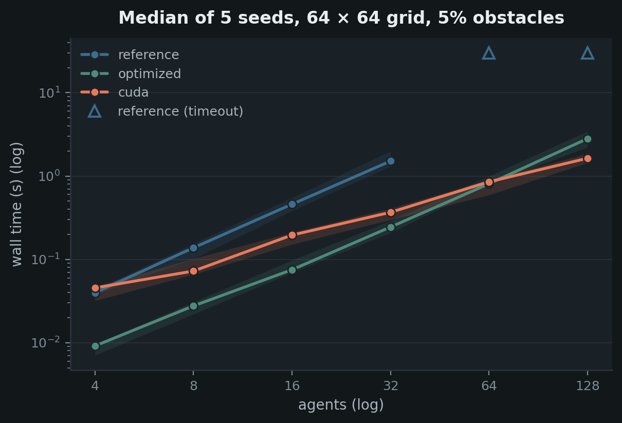
Median over seeds with a min–max band. Timeouts are their own mark at the cap rather than extrapolated or dropped: a missing point and a timeout are different results.
planviz.scaling_curve(
    {"reference": {...}, "optimized": {...}, "cuda": {...}},
    timeouts={"reference": [64, 128]},
    cap=30.0,
    highlight="cuda",
    log_x=True,
    title="Median of 5 seeds, 64 × 64 grid, 5% obstacles",
)
success_heatmap
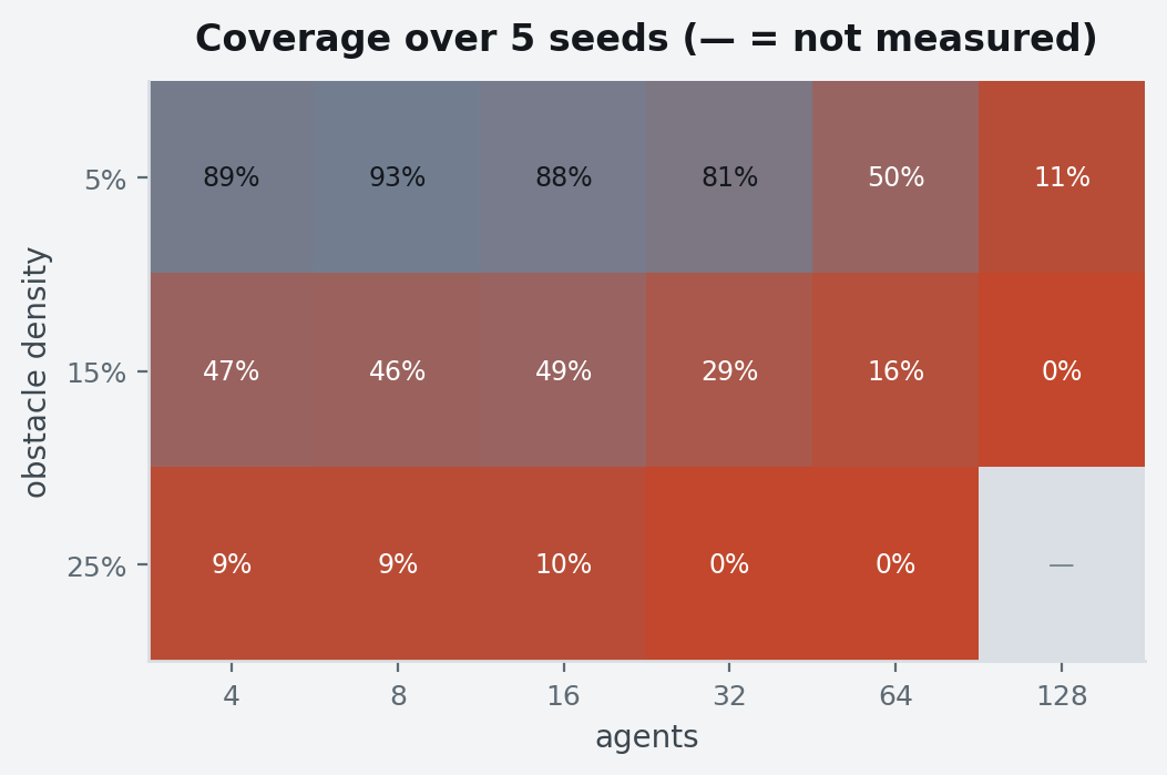
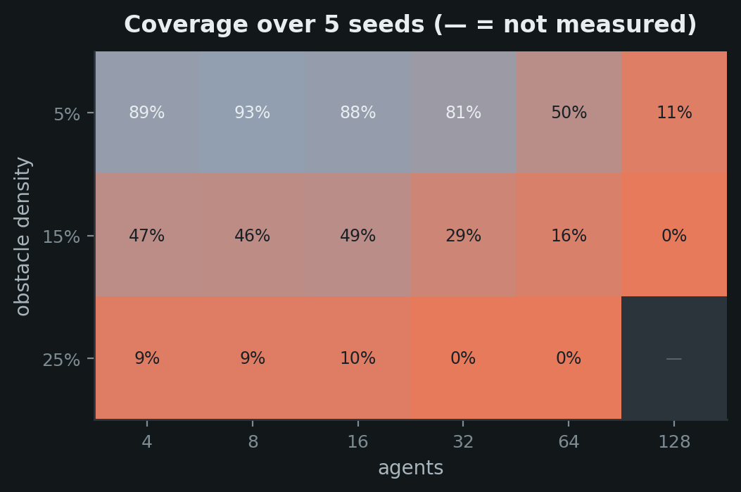
Coverage over a two-axis sweep, path (warm, nothing solved) to expanded
(cool, all solved). Unmeasured cells are an em dash, never a zero.
planviz.success_heatmap(
    matrix, x_labels=["4", "8", ...], y_labels=["5%", "15%", "25%"],
    title="Coverage over 5 seeds (— = not measured)",
)
phase_breakdown
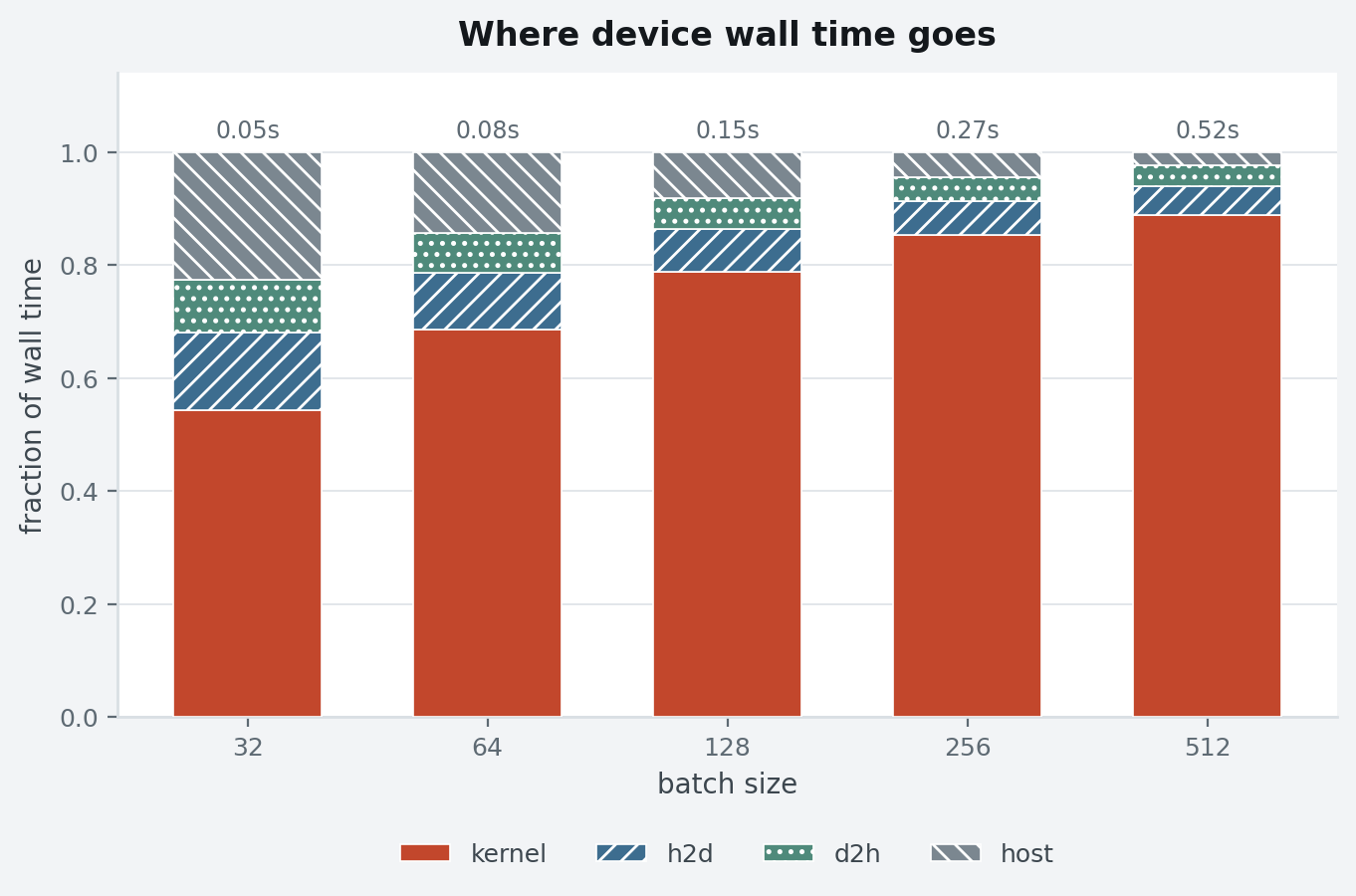
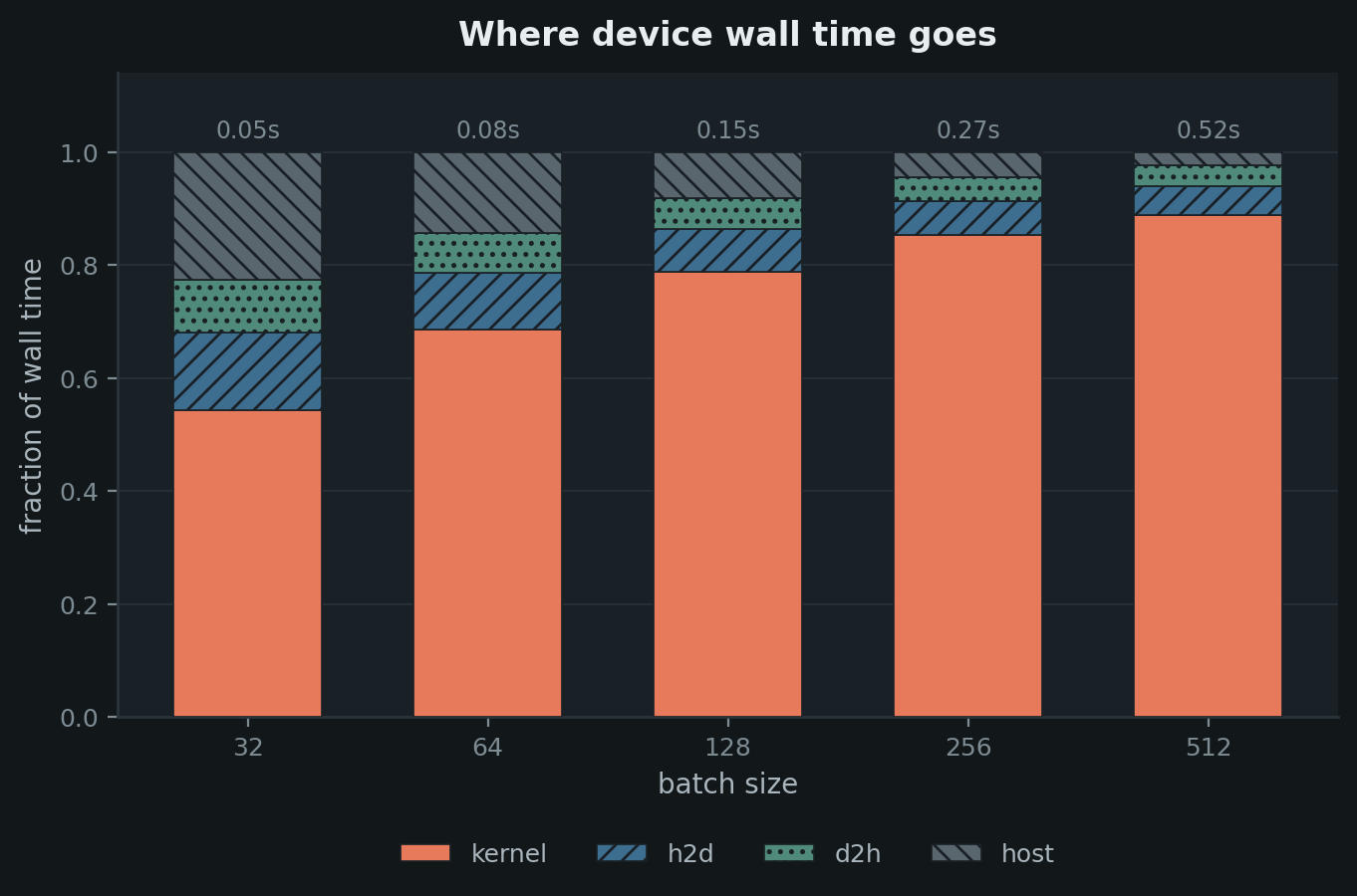
Where the wall time went, stacked and normalized, with the absolute total above each bar so the figure keeps its units. Bands differ by hatch as well as hue — four cool blues read identically in greyscale, which is the failure that motivated the second channel.
planviz.phase_breakdown(
    {"64": {"kernel": ..., "h2d": ..., "d2h": ..., "host": ...}, ...},
    accent="kernel",
    neutral=["host"],
)
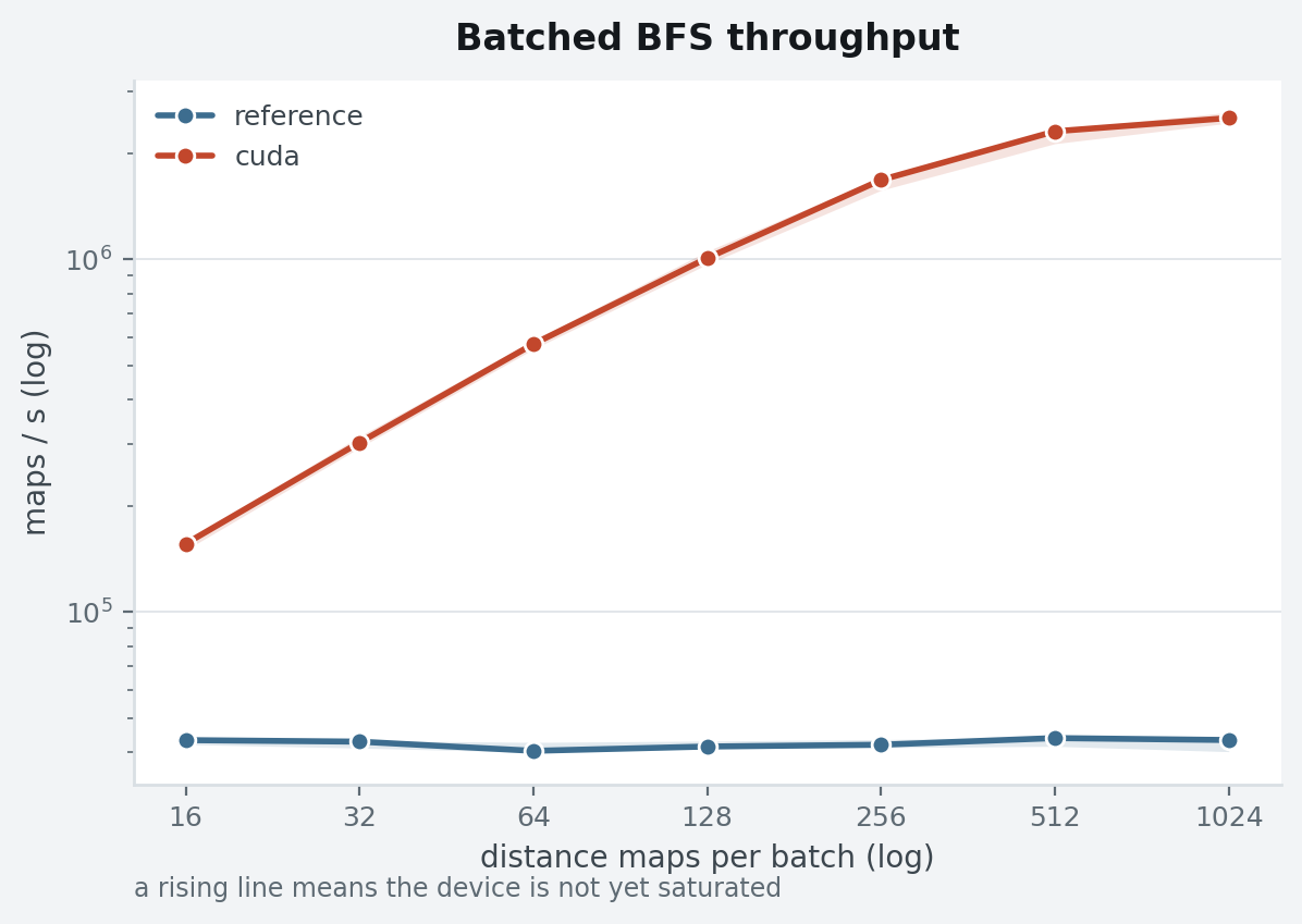
throughput_curve
Same data shape as scaling_curve, different question. Wall time always rises
with the batch; throughput says whether the device is working harder or just
working longer, and a line still climbing at the right edge means the sweep
stopped before saturation.
planviz.throughput_curve(
    series, highlight="cuda",
    xlabel="distance maps per batch", ylabel="maps / s",
)
crossover_plot
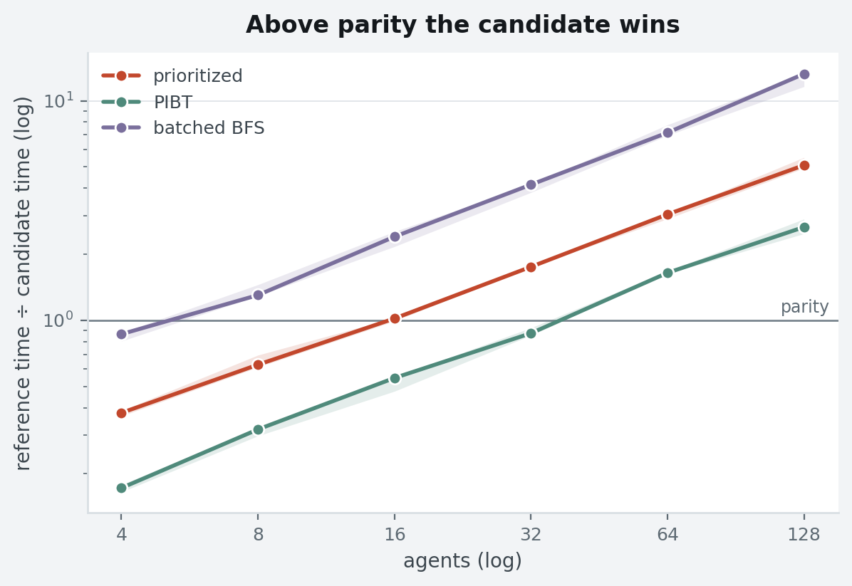
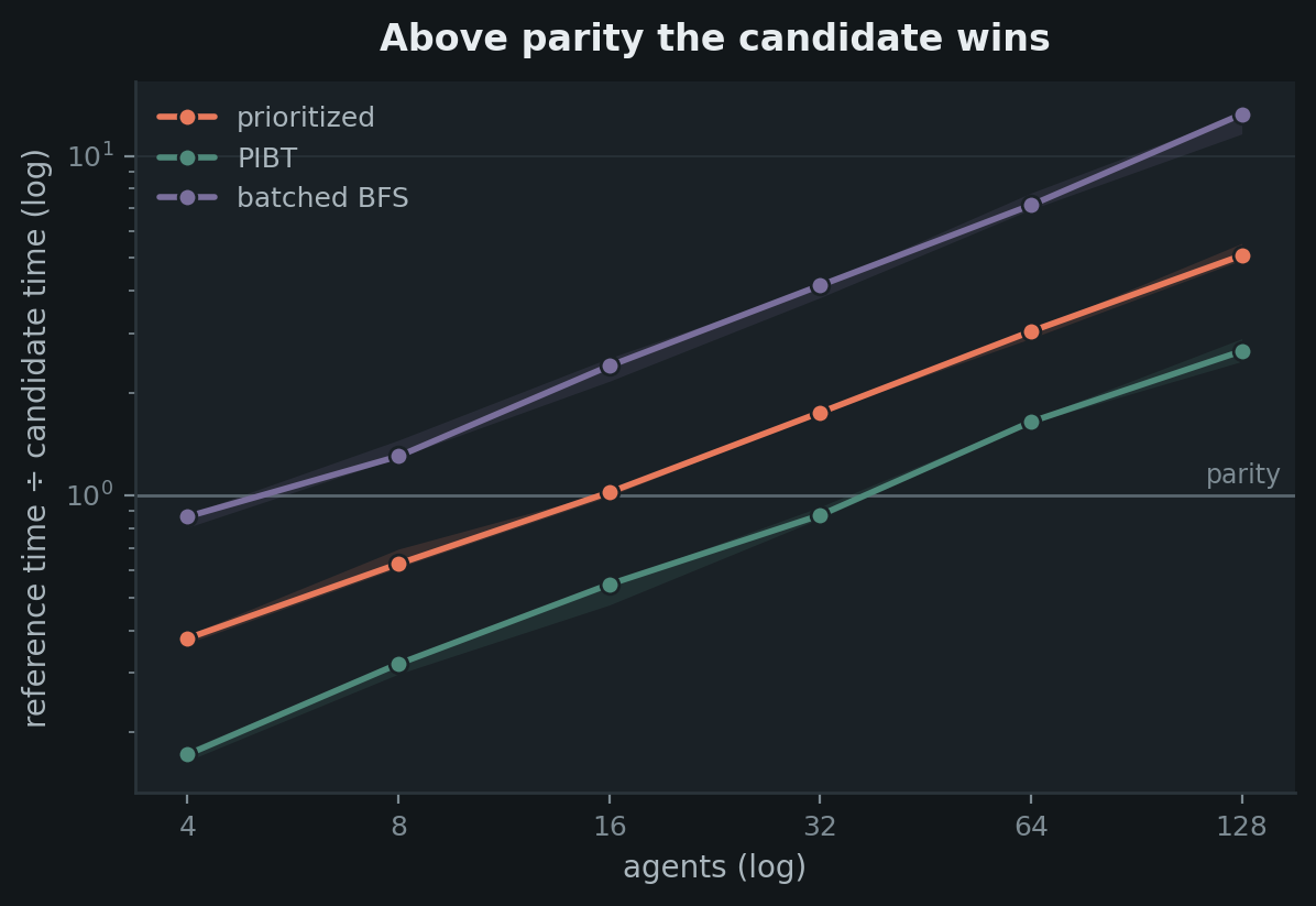
"Is the GPU faster?" has a size for an answer, not a number. The parity line is
faint because it is a reference, not a result.
planviz.crossover_plot(
    ratios, highlight="prioritized",
    ylabel="reference time ÷ candidate time",
)